Cura Infill Settings Explained: Patterns, Density, and When to Use Each
What Is Infill and Why Does It Matter?
If you’ve ever broken open a 3D print, you’ve probably noticed it isn’t solid inside. Instead, there’s a pattern of lines, triangles, or honeycomb shapes filling the interior. This internal structure is called infill, and the settings you choose in your slicer have a massive impact on print strength, weight, material usage, and print time.
Most beginners just leave infill at whatever default their slicer suggests and never think about it again. That’s a mistake. Understanding how infill works — and when to change it — is one of the fastest ways to improve your prints and save filament. Let me walk you through everything you need to know about Cura’s infill settings.
Infill Density: How Much Is Enough?
Infill density is the percentage of the interior that’s filled with material. At 0%, your print is completely hollow (just walls). At 100%, it’s completely solid. Most prints fall somewhere between 10% and 40%.
Here’s the thing most people don’t realize: the relationship between infill density and strength is not linear. Going from 10% to 20% infill roughly doubles your part strength. But going from 40% to 80% barely increases strength at all — you’re just burning filament and time.
For decorative prints: 5-10% is usually plenty. The walls provide most of the structural support, and the infill just prevents the top layers from sagging into empty space.
For general purpose: 15-20% hits the sweet spot of strength, material use, and print time. This is what I use for 90% of my prints.
For functional parts under load: 25-40% provides excellent strength. At 40%, you’re getting diminishing returns on additional infill.
For maximum strength: Instead of going above 40% infill, increase your wall count from 2-3 to 4-5. Adding walls provides far more strength-per-gram than increasing infill density. This is backed by multiple mechanical testing studies in the 3D printing community.
Infill Patterns Explained
Cura offers over a dozen infill patterns, and each has different properties. Here’s what actually matters about the most common ones.
Lines (Default)
The simplest pattern — straight lines alternating direction each layer. It’s fast to print and works fine for most purposes. The downside is that it’s strong in only two directions (along the line axes). If force is applied at an angle, lines are relatively weak. Best for: quick prints, decorative items, and general prototyping.
Grid
Grid is essentially lines printed in both X and Y directions on each layer, creating a mesh pattern. It’s stronger than lines in more directions but uses more material and takes longer. Each intersection point creates a small bump where two lines cross, which can sometimes cause issues with top surface quality. Best for: parts that need moderate multidirectional strength.
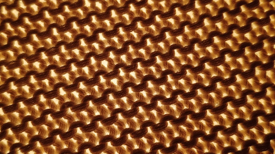
Triangles
Three sets of lines at 60-degree angles create a triangular grid. This provides excellent strength in all horizontal directions and handles shear forces well. It’s one of the best patterns for parts that experience forces from multiple angles. The tradeoff is higher print time compared to simpler patterns. Best for: structural parts, functional brackets, anything load-bearing.
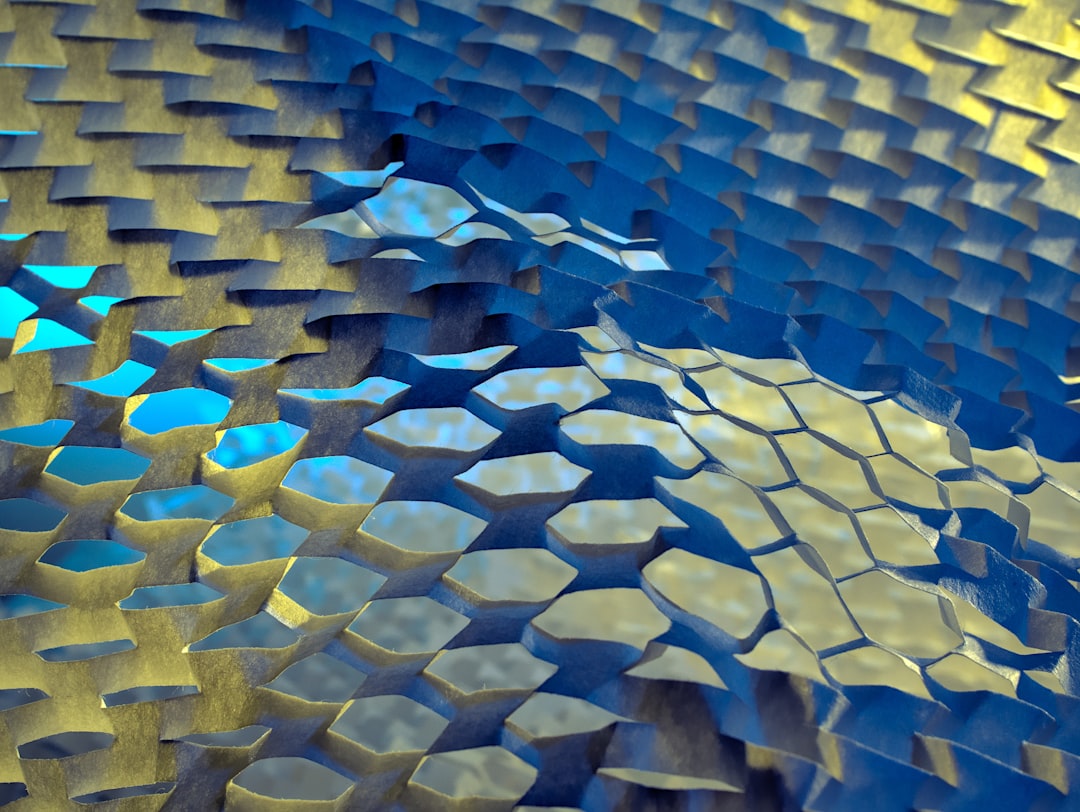
Gyroid
This is the pattern that gets the most hype, and for good reason. Gyroid infill creates a continuous, smooth, wave-like structure that provides roughly equal strength in all three axes. It has no sharp corners (reducing stress concentration), allows air to flow through (useful for molds), and looks incredible if your print is transparent. The downside: it’s slower to print due to continuous curved movements. Best for: functional parts needing isotropic strength, parts that might hold liquid, flexible prints.
Cubic
Creates a 3D pattern of tilted cubes. It provides good strength in all directions and distributes internal support evenly across the Z-axis. This makes it better than grid for taller prints where you need consistent strength throughout. Best for: tall prints, parts under compression.

Lightning
A relatively new pattern in Cura that only generates infill where it’s needed to support the top surface. The result is a tree-like branching structure that uses dramatically less material — often 50-70% less than grid at the same density percentage. The catch: it provides essentially zero structural strength. Best for: purely visual prints where you want to minimize material use.
Infill Line Distance vs. Infill Density
In Cura, you can set infill as either a percentage (density) or as a specific distance between lines. Line distance gives you more precise control, which matters when you’re engineering functional parts. For example, setting a line distance of 4mm will give consistent spacing regardless of which pattern you choose, while the same “20%” density translates to very different line spacing depending on the pattern.
For most users, percentage is fine. But if you’re optimizing for specific mechanical properties, switch to line distance and dial it in through testing.
Infill Overlap: The Hidden Setting That Matters
This setting controls how much the infill lines overlap with the inner walls. Too little overlap and you’ll see gaps between walls and infill — visible as a slightly rough surface or weak delamination points. Too much overlap creates over-extrusion bumps where infill meets the wall.
Cura defaults to 30%, which works for most setups. If you see gaps between walls and infill, bump it to 40-50%. If you see bumps or blobs at wall-infill junctions, reduce it to 20-25%.
Gradual Infill Steps
This is one of Cura’s most underused features. Gradual infill starts with lower density at the bottom of your print and increases it near the top. Why is this useful? The top surface needs infill support directly below it to bridge without sagging. But the rest of the print might not need the same density.
Enable gradual infill with 2-3 steps, and you’ll save significant material and print time while maintaining a clean top surface. This is especially effective for tall prints with flat tops.
Infill Before Walls vs. Walls Before Infill
By default, Cura prints walls before infill. This gives you the cleanest outer surface because the walls are laid down on a smooth, consistent surface. However, printing infill first can improve the structural connection between walls and infill.
My recommendation: keep the default (walls first) for visual prints. Switch to infill-first only for structural parts where wall-infill bonding is more important than surface aesthetics.
Connected Infill Lines
When enabled, this setting makes the infill extrude as one continuous line rather than starting and stopping. This reduces retraction moves (less stringing inside the print) and can improve print time. It works best with line and zigzag patterns. For other patterns, it may not have a noticeable effect.
Real-World Infill Recipes
After thousands of prints, here are my go-to infill configurations for common use cases:
Desk toys and figurines: 10% lightning infill. Minimal material, fast prints, no structural needs.
Enclosures and boxes: 15% grid. Light but rigid enough to hold shape.
Phone stands, holders, hooks: 20% triangles. Good all-around strength for daily use items.
Brackets and mounts: 30% gyroid + 4 walls. Strong in all directions with excellent wall adhesion.
Load-bearing parts: 40% triangles + 5 walls. At this point, walls contribute more to strength than additional infill.
Vases and containers: 0% infill, vase mode (spiralize outer contour). Single continuous wall, no infill needed.
The Strength Formula Most People Get Wrong
Here’s the key insight that took me years to learn: wall count matters more than infill density for overall part strength. A part with 5 walls and 15% infill will be stronger than the same part with 2 walls and 50% infill — while using less material and printing faster.
This is because the outer perimeters (walls) form a continuous shell that handles tensile and bending forces far better than the discontinuous internal structure. Think of it like a cardboard box: the strength comes from the walls, not from packing material inside.
So before you crank up infill density, ask yourself: would an extra wall or two solve this better? The answer is usually yes.
Tips for Better Top Surfaces
If your top surfaces look rough or have visible infill showing through, these settings help more than increasing infill density:
Increase top layers from 4 to 6-8. More top layers give the slicer more bridging passes to create a smooth ceiling over the infill below.
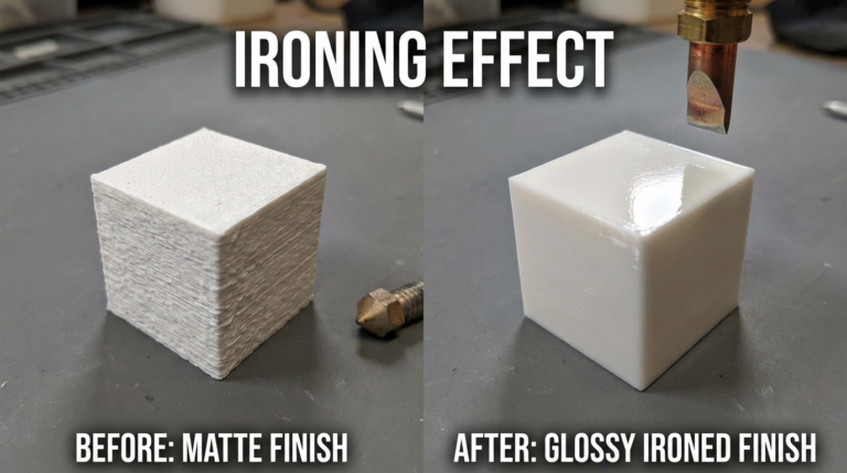
Enable ironing for the top layer. This makes the nozzle do a second pass over the top surface at minimal extrusion, essentially smoothing it like an iron. The result is a nearly glass-smooth top surface.
Reduce top layer speed by 30-40% from your normal print speed. Slower top layers bridge better and produce a more consistent surface.
Final Thoughts
Infill is one of those settings that’s easy to ignore but rewarding to optimize. The right pattern and density can save you hours of print time and meters of filament across a year of printing. Start with 20% grid for general prints, experiment with gyroid for functional parts, and always consider adding walls before adding infill density. Your prints — and your filament budget — will thank you.