PLA Filament Silk vs Matte vs Glossy: How Finish Changes Color Accuracy
The three PLA finish families and what they actually trade off
PLA filament silk matte color accuracy comparison conversations usually stall on aesthetics — silk looks pretty, matte looks classy, glossy looks plastic — without acknowledging that finish and color accuracy are linked variables. The same color number, printed in silk and printed in matte, will not look like the same color in a photograph or under a phone flashlight. That is not a defect of either filament; it is physics. Once the relationship between finish and color is understood, picking the right filament for a given project becomes a deliberate choice rather than a test-print roulette.
The three families are silk PLA, matte PLA, and standard glossy PLA. Silk PLA is the most reflective of the three, with a metallic sheen that comes from elongated polymer chains aligned during extrusion. Matte PLA is the least reflective, with a chalky surface that comes from microscopic ceramic or mineral fillers that scatter light at the surface. Standard glossy PLA sits in the middle — it has a clear, slightly reflective surface without being mirror-like or chalky. Each finish handles color differently, and each interacts with lighting differently.
Why the same color number looks different across finishes
Color accuracy is what we perceive when light hits a surface, bounces off the pigment particles, and returns to the eye. The path of that bounce is not the same across finishes. On silk PLA, the bounce is partially specular — some light reflects directly off the surface like a mirror, never reaching the pigment at all. That direct reflection is what gives silk its sheen, and it also dilutes the perceived color. A silk red looks slightly washed out compared to a matte red of the same pigment because the white reflection mixes with the red.
On matte PLA, the bounce is fully diffuse — light hits the ceramic fillers, scatters in all directions, and the color we see is essentially the average bounce off the embedded pigment. There is no specular component to dilute the color, which is why matte finishes look more saturated and richer than silk or glossy at the same pigment level. The trade-off is depth perception: matte surfaces look flatter and lose the visual cues that suggest curvature and volume, which matters on miniatures and detailed pieces.
On standard glossy PLA, the bounce is somewhere between the two — there is a specular component but it is smaller than silk, and there is enough surface clarity that the embedded pigment shows clearly. Glossy is the closest match to what color samples on a screen suggest, because most photography of color samples is done under flat diffuse lighting that minimizes the specular component.
The lighting trap
The lighting under which you compare filament colors changes the answer. A spool of silk red looks deeper red under indoor LED lighting than it does under direct sunlight, because direct sunlight is high-intensity and produces a bright specular highlight that washes out the color. The same matte red looks more uniform across both lighting conditions because matte has no specular component to wash out.
This is the trap that catches people comparing filaments on a YouTube review or a product photo. The reviewer’s lighting setup is not your room’s lighting setup, and a color that looks correct in their video may look noticeably different on your printer. The fix is to compare under the lighting where the print will actually live. A miniature destined for a tabletop game under warm LED room lights should be color-tested under warm LED room lights, not under daylight or under photographic strobes.
A repeatable color comparison test you can run
The test that actually answers “which filament has accurate color” runs in twenty minutes per filament and produces results you can compare side by side. Print a 50x50x3mm flat plate at 0.2mm layer height, 100% infill, top surface ironed if your slicer supports it. The plate should print cleanly and quickly, and the flat ironed surface gives you a uniform area to evaluate.
Compare two plates of nominally the same color (say, “fire engine red”) from different brands or different finish families. Place them side by side under the lighting where the final print will live. Photograph both with the same phone or camera in the same shot — different cameras introduce their own color shift. The comparison answers two questions at once: how close are the two filaments to each other, and how close is each to the color the brand named.
For absolute accuracy rather than relative comparison, use a calibrated color reference like a Pantone chip or a printed color card and compare each plate to the chip under daylight-balanced lighting. This is more work but produces a quantitative answer — many hobbyists are surprised how far some “red” filaments are from any conventional definition of red.
How major brands handle silk, matte, and glossy
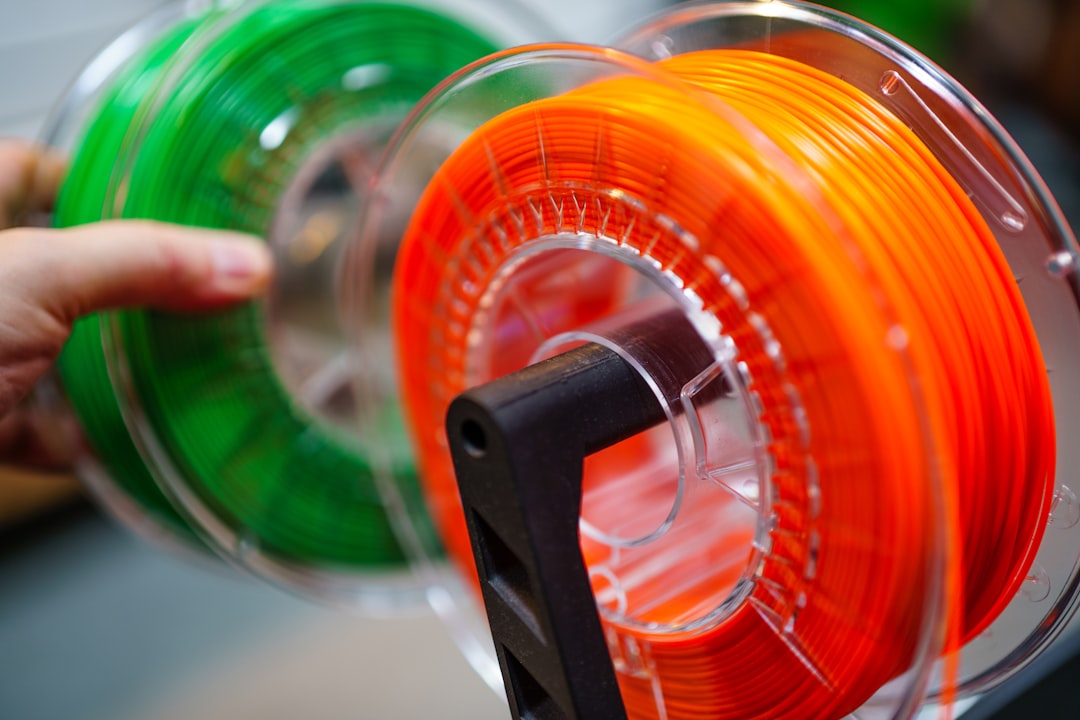
The brands that take color accuracy seriously formulate their silk, matte, and glossy lines as separate pigmentation runs rather than recoloring a single base. Polymaker PolyLite, Prusament, and ColorFabb fall in this category — their silk red, matte red, and standard red are not the same pigment in different finishes; they are three different formulations chosen so the perceived color matches across finishes.
Brands that use one pigment formula across finishes — many cheaper brands fall here — produce noticeably different colors across their silk, matte, and standard lines. The “red” in their silk PLA is darker and more washed out than the “red” in their matte PLA, because the specular reflection of silk dilutes the perceived color and the brand did not compensate. Hobbyists discover this when they buy “red” of a single brand in two finishes for a multi-material print, and the colors do not match.
The pricing usually reflects this. Brands with cross-finish color matching cost noticeably more per kilogram than brands that do not, and the price difference is real engineering work. For projects where color match matters — multi-color prints, set-of-three minis, decor pieces — the price difference pays back in not having to reprint with different brands.

Practical picks for cosplay, miniatures, and decor
Cosplay armor benefits from silk PLA because the metallic sheen reads as “metal” to the eye even when the underlying pigment is plastic. The color accuracy trade-off is acceptable because cosplay finishing usually involves additional weathering, drybrushing, or paint passes that bring the color back. Silk works particularly well for steel, bronze, gold, and brass colors where the specular highlight is part of the look.
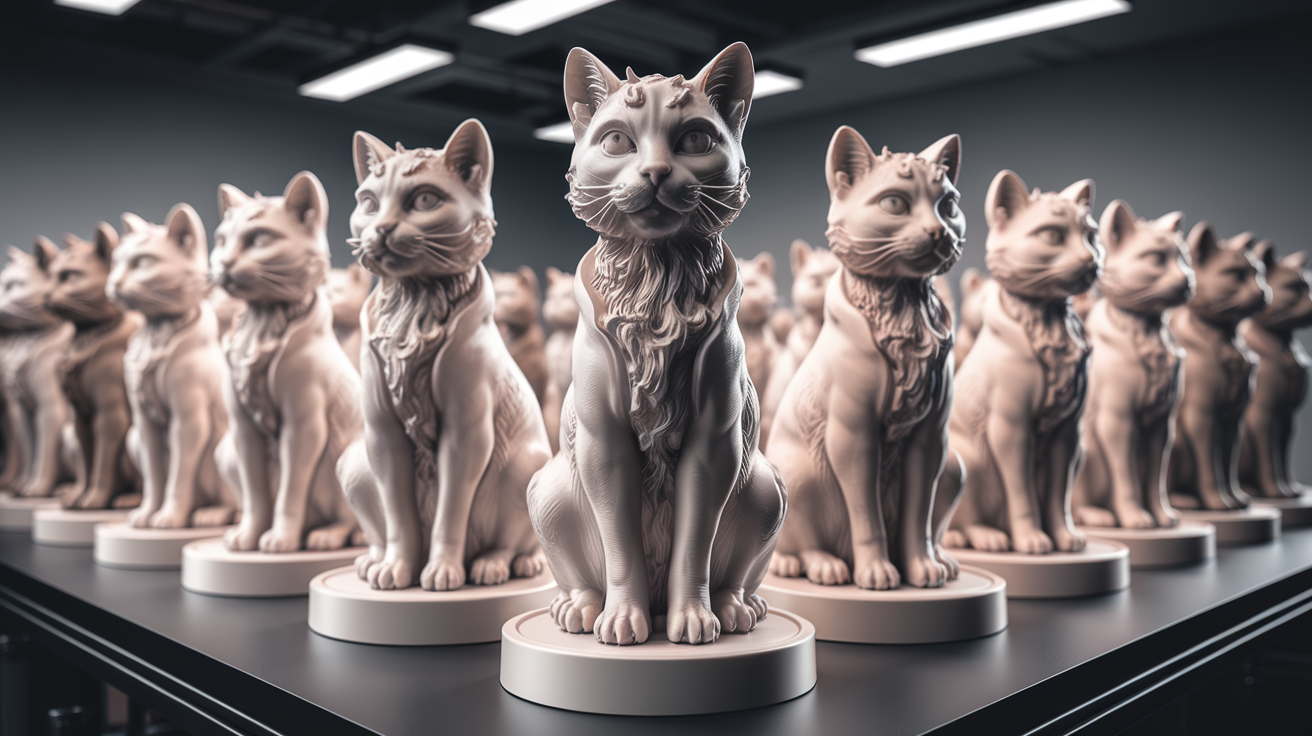
Miniatures and tabletop figures benefit from matte PLA because the diffuse reflection eliminates the visual confusion between paint and plastic. Painters working on miniatures want the unpainted plastic to disappear under primer and paint, and matte PLA does that better than silk or glossy. The flatter color also means primer and paint adhere with predictable opacity rather than fighting a specular base.
Functional decor — vases, lamp covers, furniture accents — varies. A decorative bowl looks elegant in glossy because the curve catches light; a wall hanging looks better in matte because flat surfaces benefit from saturated diffuse color. Lamp covers are interesting because backlight changes everything — silk and matte look almost identical under transmitted light, while glossy can produce hot spots.
When silk loses to matte, and vice versa
Silk PLA loses to matte when surface defects matter. Layer lines, blemishes, and small artifacts are more visible under specular reflection than under diffuse reflection — the highlight catches every imperfection. A print with even minor surface flaws looks worse in silk than in matte. If your printer or filament is producing visible artifacts, matte hides them; silk amplifies them.
Matte PLA loses to silk when depth and volume matter. A complex sculpted surface — flowing fabric, organic curves, layered armor — reads better in silk because the specular highlights provide the visual cues for depth. The same surface in matte looks flat, almost cartoonish. The lesson: pick finish based on the geometry being printed, not on personal preference for one finish over another. Both are right for the right print, and both are wrong for the wrong one.
Multi-color projects and the cross-finish color match problem
Multi-color projects expose a problem that single-color prints hide: most filament brands do not match colors across their finish lines. The “deep blue” silk PLA from a brand and the “deep blue” matte PLA from the same brand are usually two different blues, and on a print that uses both they read as a mismatch rather than as a coordinated palette. The mismatch is not a printer error; it is the brand’s pigment formulation choice, and it is invisible until the print is assembled.
The defense against the mismatch is to commit to a single finish family for any one project. A miniature in matte should be entirely matte, including the gem accent that you might have wanted to do in silk. The eye reads finish consistency more reliably than it reads color consistency, and a project that drifts across finishes looks unfinished even when each individual color is correct. Save mixed-finish techniques for paint, where they can be controlled within a unified surface.
If a multi-finish print is unavoidable — say, the design specifically calls for a metallic accent on a matte base — the lesson learned by experienced multi-material printers is to test the combination on a small dummy piece before committing to the full print. Print a 30mm cube with a small inset of the accent color in the accent finish, on the actual base color in its actual finish. If the combination reads correctly on the dummy, it reads correctly on the print. If it does not, swap finishes or swap brands and test again. The hour spent on the test is the hour saved at the assembly stage when the colors do not match.